
Project Overview
SADAD is a payment service platform designed to streamline the process of managing and paying government bills. Despite its essential functionality, the platform’s existing screens lacked usability and visual consistency, leading to user frustration and inefficiency. My role in this project was to revamp the SADAD screens, ensuring a seamless and intuitive user experience while aligning the design with modern UI/UX standards.
Objective
The primary goal of this redesign was to improve the usability and visual appeal of the SADAD interface, making it more efficient for users to navigate and complete their payment tasks. Specific objectives included:
Simplifying the process for managing and paying government bills.
Enhancing the information hierarchy to ensure users can quickly access critical details.
Incorporating user feedback to address pain points and boost satisfaction.
Aligning the design with industry best practices to establish a modern, cohesive aesthetic.
Quantitative research
To build a user-centered redesign, I collaborated with the project manager to conduct in-depth quantitative research. We used tools like Maze to engage with users and gather insights into their pain points and challenges with the current SADAD screens.
Key Research Activities:
Surveys and Task Analysis: Collected user feedback on specific tasks, such as locating bill details or completing a payment, to identify inefficiencies.
Data Analysis: Evaluated metrics like task completion time, error rates, and satisfaction scores to quantify the impact of design flaws.
Insights Gained:
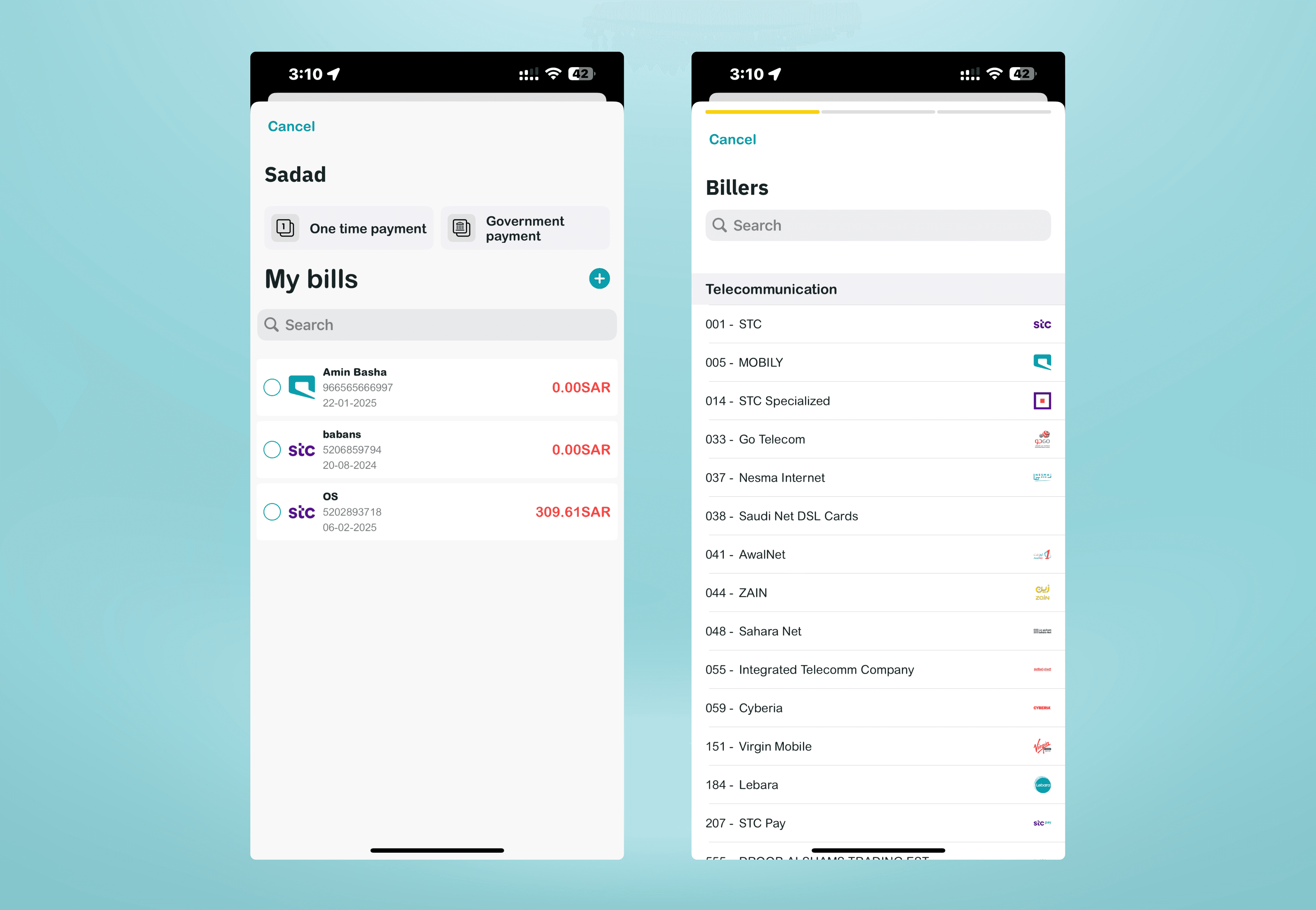
• Users found the current interface cluttered, making it difficult to locate key features.
• Navigation inconsistencies led to frequent errors and frustration.
• The lack of visual hierarchy and clear labels resulted in a steep learning curve for new users.
These insights formed the foundation for the redesign strategy, ensuring that each pain point was directly addressed.

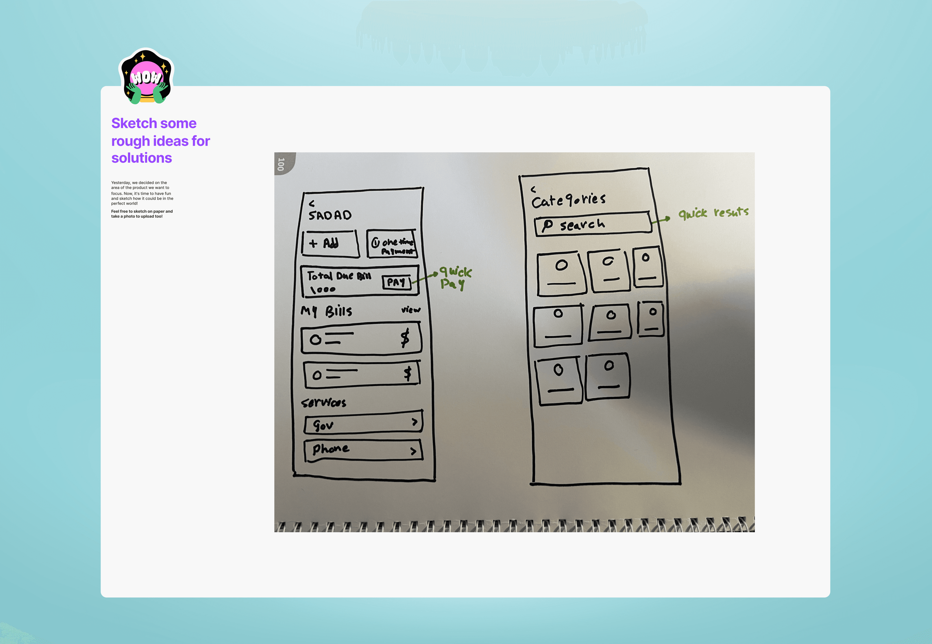
Ideation and Wireframing
With a clear understanding of user challenges, I moved to the ideation phase to generate design solutions. I started by creating mood boards to establish the visual direction and draw inspiration from best practices in fintech and payment platforms.
Key Activities:
Brainstorming and Sketching: Collaborated with team members to explore various layouts and features, followed by creating initial low-fidelity sketches.
Wireframing: Designed low-fidelity wireframes to experiment with layouts, navigation structures, and content placement, ensuring alignment with user needs and business goals.
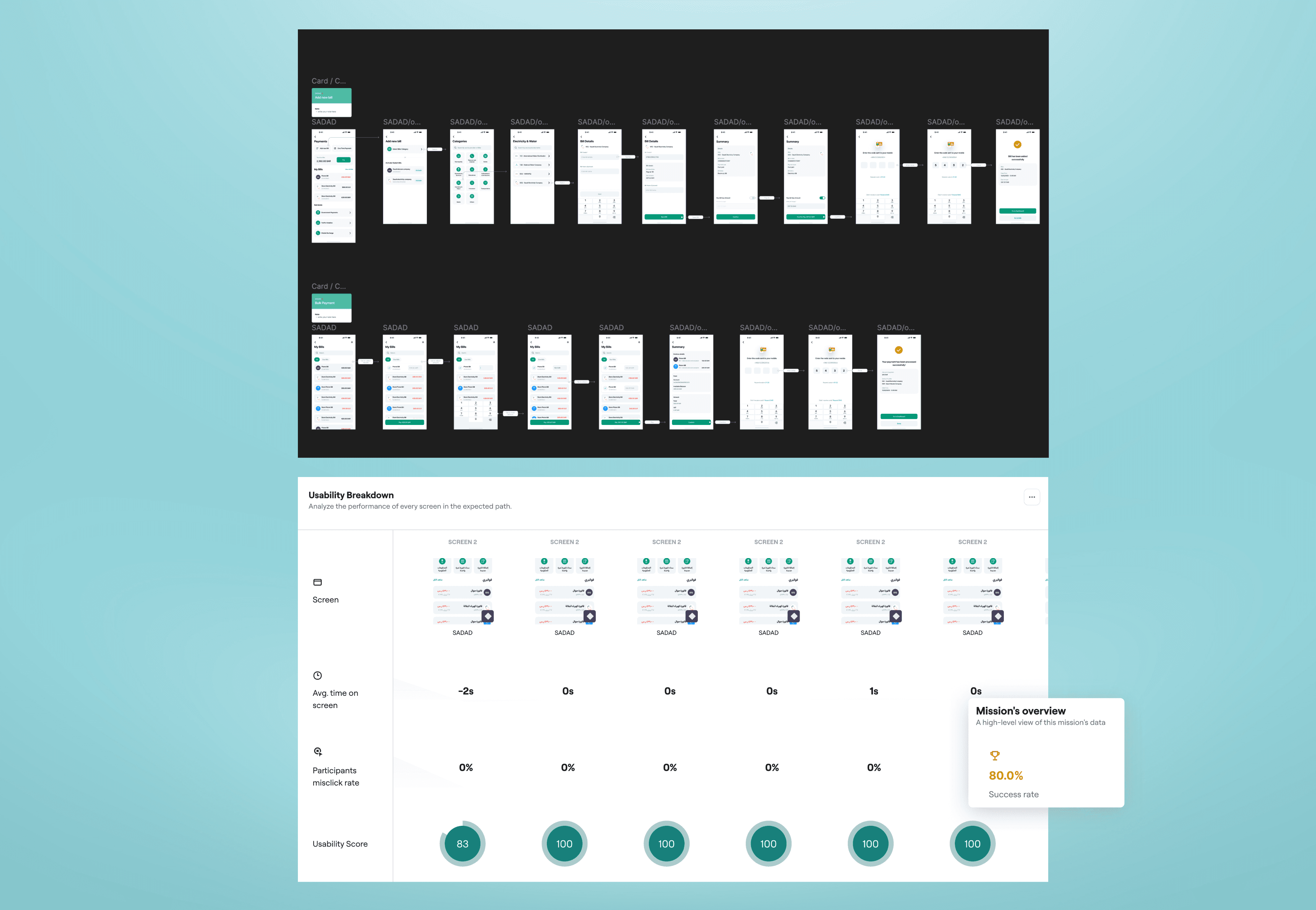
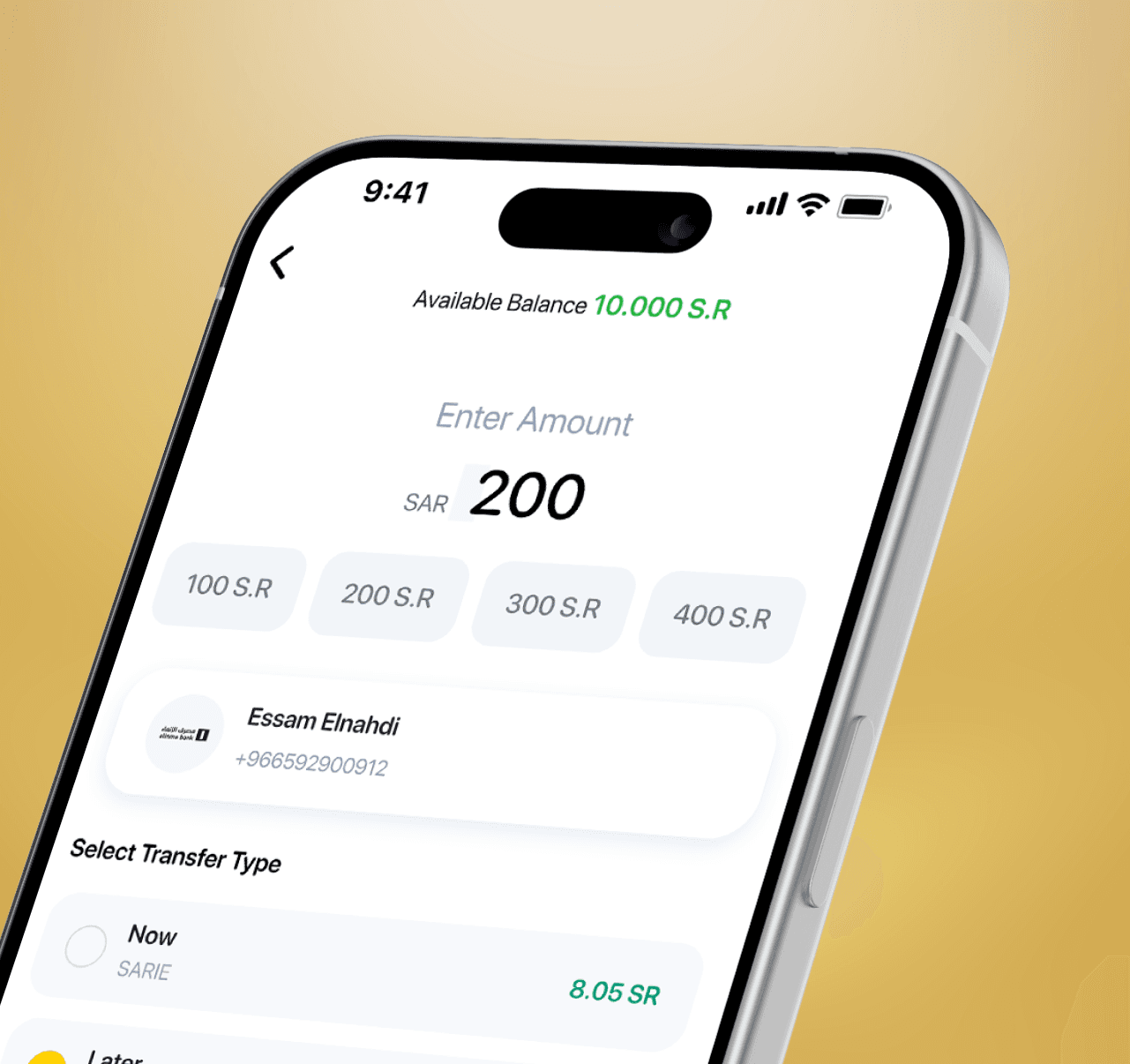
Final Design and Usability Testing
Building on the wireframes, I developed high-fidelity designs that focused on creating a visually cohesive and user-friendly interface. The new design prioritized clarity, efficiency, and accessibility, with a modern aesthetic tailored to SADAD’s target audience.
Usability Testing:To validate the final design, I conducted usability testing in collaboration with the project manager. we analyzed user interactions with the prototype to ensure the design met its objectives.Key Findings and Adjustments:
• Navigation Improvements: Users completed tasks 30% faster due to streamlined navigation.
• Visual Hierarchy: Key information, such as due dates and payment amounts, was now immediately visible, reducing user confusion.
• Error Reduction: Enhanced button placement and clear labeling significantly reduced errors during payment processing.With these insights, I made final adjustments to optimize the user experience further. The redesigned SADAD screens were then handed off for development, ensuring a smooth transition with comprehensive design documentation and assets.


Let's connect
I'm not just here to design products; I'm here to connect with people.
As a product designer, I'm on an exciting journey to blend creativity with technology to craft memorable user
Phone Number
Current Residence
San Fransisco